2nd May 2023 - 16th May 2023 (Week 5 - Week 7)
Aidel Ivo Johan bin Mohamad Ismail / (0360349)
Bachelors of Design in Creative Media / Typography / Taylor's Lakeside University
Class SummaryWeek 5
Absent Due to Hari Raya.
Week 6
During week 6 of our course, our main focus was on task 2. As part of our progress, we shared our work on Facebook and received valuable feedback from Mr. Vinod. Throughout the session, Mr. Vinod provided us with insightful teachings and advice regarding the various layouts we presented to him. I made sure to take notes on his recommendations, as well as those he gave to my classmates, for future reference.
In class, Mr. Vinod allocated time for us to make revisions or start afresh with our work. Additionally, he shared examples of effective headline expressions and guided us on the essential elements to include in our blog. His advice emphasized the importance of simplicity as the foundation for a strong idea.
Week 7
During week 7, Mr. Vinod reviewed our progress on task 2 that we had worked on throughout the week, but he did not provide any feedback for this particular week. Instead we focused on getting started on our next task.
Instructions
Typographic Exploration & Communication
In this task, we applied our knowledge gained from exercises 1 and 2. The objective was to creatively convey the given content typographically in a 2-page editorial spread measuring 200mm x 200mm per page. We were presented with three text options and were required to select one for this task. It was specified that no images could be used, but minimal graphical elements such as lines or shades were permitted in a limited capacity.
References
Before attempting my hand at a design, I've decided to do research on layouts on Pinterest. By using magazines layouts, it gives ideas on how to develop sketches and arrangements for an editorial spread. Figure 2.1.1
Figure 2.1.2
Figure 2.1.3
By identifying the given headlines, my first thought is to identify the keywords within each headline.
- The Role of Bauhaus Thought on Modern Culture
- A Code to Build On and Live By
- Unite to Visualize A Better World
Sketches
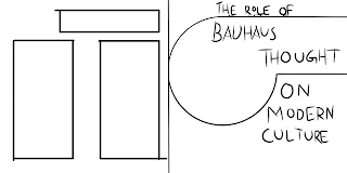
With the aforementioned research that has been put into consideration, I attempted my hand at some sketches with the headline expression that was given to me. I tried out different arrangements for the title and text of bodies.
Figure 2.2.1
Figure 2.2.2
Figure 2.2.3
Layout Explorations (Blocked out)
Figure 2.4.1
Figure 2.4.2
Figure 2.4.3
Shortlisted Layouts
Figure 2.5.1
Font: Futura Std. (Light Condensed)
Point size: 10 pt. (Body Text); 10 pt. (Sub Text); 27 pt. (Lead-in Text)
Leading: 14 pt. (Body text, Sub text); 27 pt (Lead-in Text)
Paragraph spacing: 14 pt.
Line Length: 31
Figure 2.5.2
Font: Futura Std. (Light Condensed)
Point size: 10 pt. (Body Text); 10 pt. (Sub Text); 27 pt. (Lead-in Text)
Leading: 14 pt. (Body text, Sub text); 27 pt (Lead-in Text)
Paragraph spacing: 14 pt.
Line Length: 37
Figure 2.5.3
Font: Futura Std. (Light Condensed)
Point size: 10 pt. (Body Text); 10 pt. (Sub Text); 27 pt. (Lead-in Text)
Leading: 14 pt. (Body text, Sub text); 27 pt (Lead-in Text)
Paragraph spacing: 14 pt.
Line Length: 37
Final Design
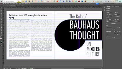
The following designs are my finalised layouts with and without the grid.
Figure 2.6.1 Layout with Grid - JPEG
Figure 2.6.2 Layout without Grid - JPEG
Figure 2.7.1 Layout without Grid - PDF
Figure 2.7.1 Layout with Grid - PDF
Font: Futura Std. (Light Condensed)
Point size: 10 pt. (Body Text); 10 pt. (Sub Text); 27 pt. (Lead-in Text)
Leading: 14 pt. (Body text, Sub text); 27 pt (Lead-in Text)
Paragraph spacing: 14 pt.
Line Length: 31
Feedback
Week 6
General Feedback:
During our discussions in Week 6, we received valuable feedback from Mr. Vinod regarding our work. One important aspect highlighted was the need to pay attention to small details, such as alignments, to ensure a cohesive design. It was emphasized that maintaining the same line length for each paragraph within a page contributes to visual consistency. Mr. Vinod also advised us to avoid using contrasting elements, such as a black "box" placed on top of the page, as it can disrupt the overall layout. Instead, he emphasized the importance of maintaining cross alignment throughout our designs, creating a harmonious composition.
Specific Feedback:
Avoid hyphenation, be careful for widows and check for cross alignment. Align visuals similarly in order to achieve cleaner lines, avoid the usage of too much contrast.
Week 7
No feedback.
Reflection
Experiences
In this task, I applied the skills and knowledge I acquired from previous exercises. I found it challenging to express the title since it involved words of varying lengths that needed to be combined with the relevant keyword.
Observations
I learned that conducting research and gathering references at the beginning of the task is crucial as it provides a foundation and inspiration. Throughout the stages, I realized the importance of sketching. Although there were some differences during the digitization process, the sketches provided a basic layout idea and served as a guide for further development. Additionally, I discovered the significance of paying attention to details at each stage. In my initial layout exploration, I made mistakes that could have been avoided by checking the details. Text-related aspects such as ragging and cross alignments play a vital role in the overall appearance of the layout.
Findings
This project highlighted the importance of text placement in guiding viewers' eyes and conveying the intended message, particularly with the title. As the first thing viewers see and read, the title's expression and placement significantly impact the interaction between viewers and the content.
Futher Readings
"The Elements of Typographic Style" by Robert Bringhurst - This book is a comprehensive guide to typography, covering various aspects including type design, letterforms, spacing, and more.
"Thinking with Type: A Critical Guide for Designers, Writers, Editors, and Students" by Ellen Lupton - This book explores the principles of typography and provides practical examples and exercises for improving typographic skills.


Comments
Post a Comment